Mt. Lebanon Shaker Sign - Store & Shaker Cloaks
Mt. Lebanon Shaker Sign - Store & Shaker Cloaks
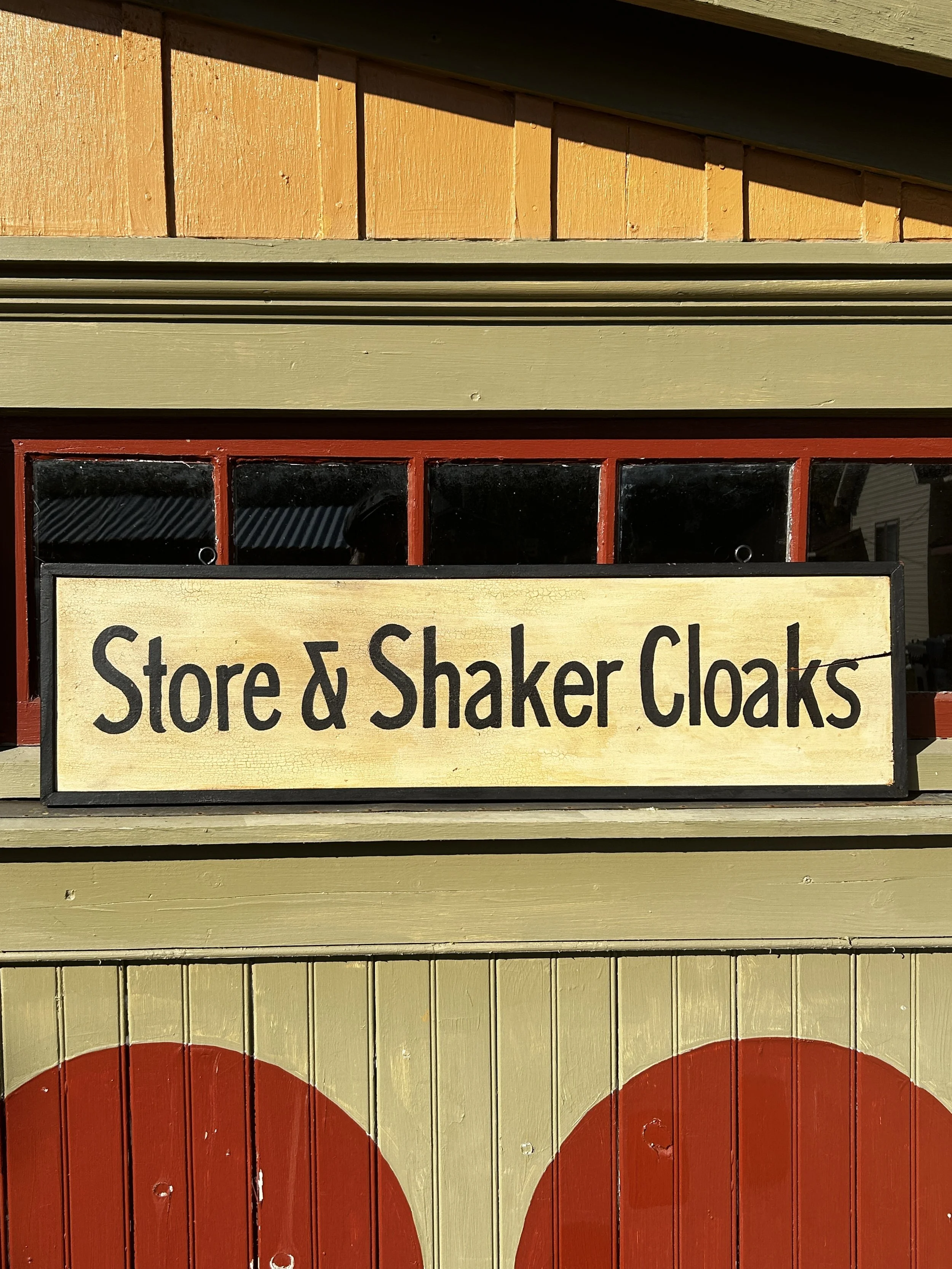
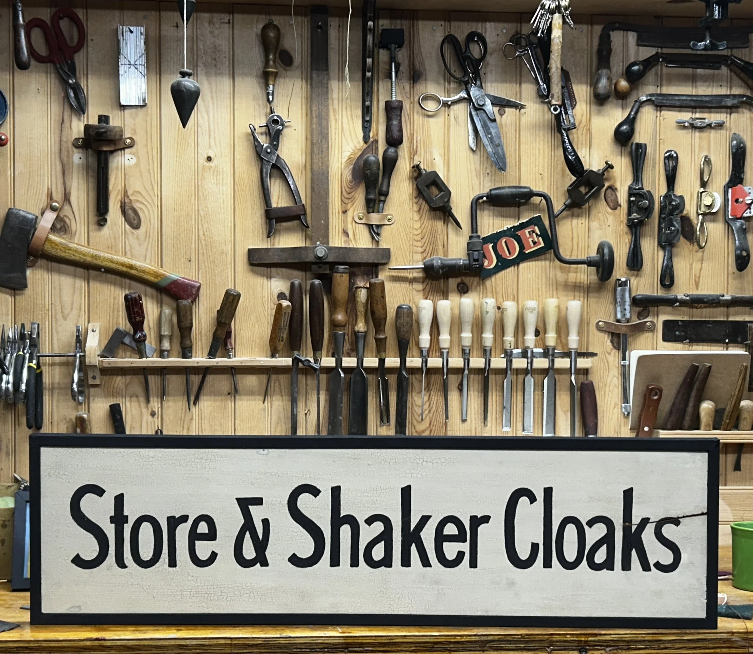
Store & Shaker Cloaks
I first saw this sign about a month ago hanging in the collection of the Shaker Museum in East Chatham, NY. I was teaching theres and invited to browse the collection stored behind-the-scenes.
I’ve a close association with the Shakers. I’ve taught at Sabbathday Lake Shaker Village - home of the last living and working Shakers - several times. The Shaker aesthetic has always been a voice that spoke to me and involvement with ongoing work is profoundly important.
This sign - like many Shaker artifacts - is striking in its simplicity. When I painted it, knowing was following the hand of someone that believed to be spiritually guided in his work, was moving. Every stroke is simple and reserved. There’s little wasted energy and the stroke was exactly two widths of the brush I was using.
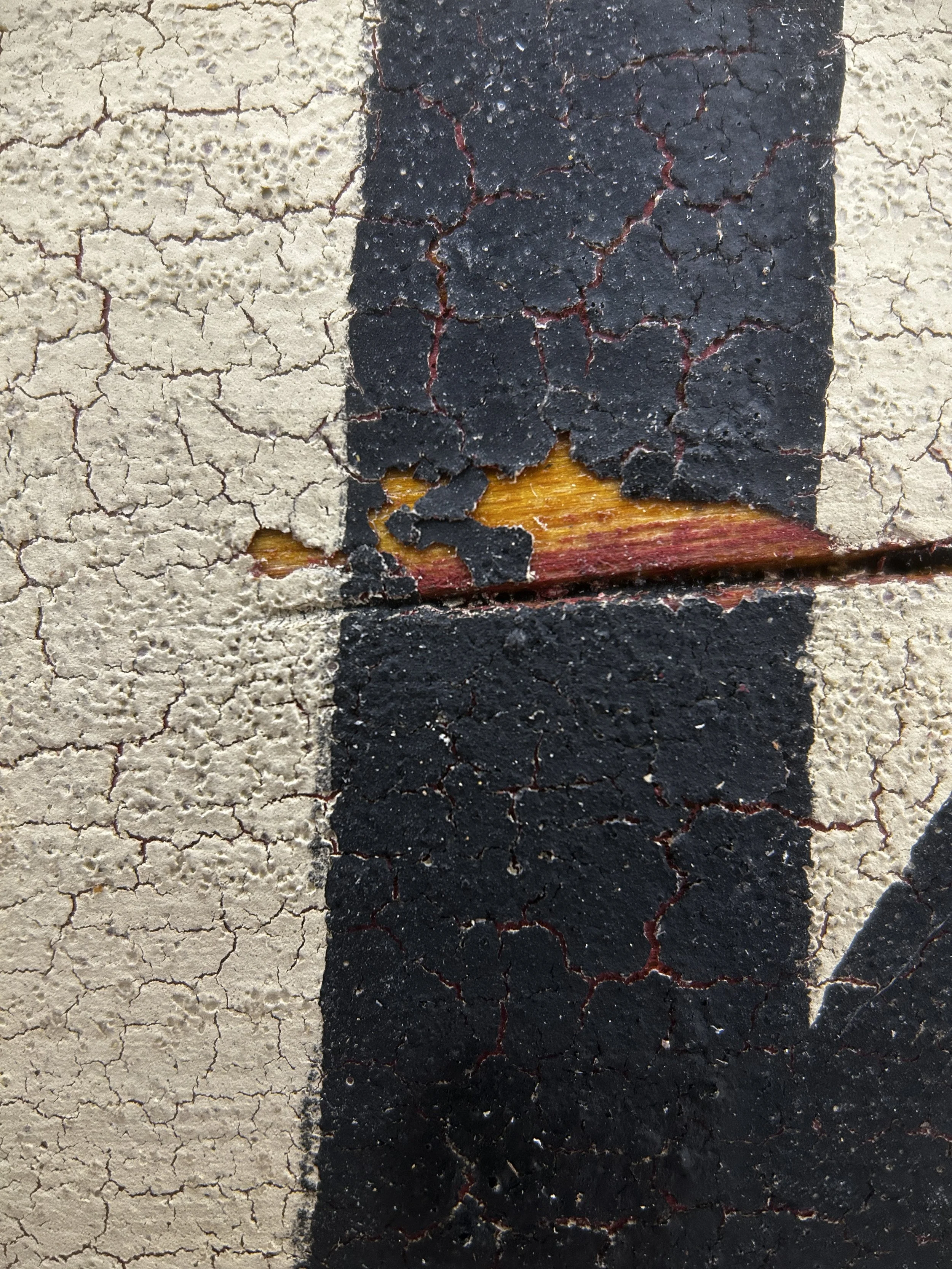
I chose this linden (boxwood, whitewood) board purposefully because it was cracked. I had developed a system to paint cracked boards in a manner that the crack appeared to have developed years after the sign was finished and hung. There must be no paint or finish in the crack and the paint must chip alng the break. I think I pulled this off!
My signs are painted with traditional milk paints and are to be hung indoors or under a covered roof.
It is 9 3/4’ wide and 35 3/8” long and 7/8” thick - a bit smaller than the original.
I’ve included a photo of where the original sign can be seen over the door of the Church Family Office at Mt. Lebanon, NY. c. 1920. The postcard is available to see - as is the original sign - at shakermuseum.us
Each sign will be well packaged and shipped from my shop to your door.
++++
Further comments about approach and technique below.
I’m not the only artist out here painting and restoring historic signs. We all face similar hurdles in how folks perceive our work. That’s probably true of most art and artists, but in this digital world, folks don’t seem to understand why our work is different from many folks creating signs and selling them as art or accurate reproductions. Many of these signs are painted using digital stencils, or worse, applied vinyl.
Though I use digital tools to create my signs, the work I do on the computer I learend to do with a pencil, ruler and tracing paper. My approach and my finished work has not changed except but to improve with practice.
I create two kinds of signs - Historic signd and fantasy historic sign. Both require the same skill level and deliver the same level of finish. It’s about approach. I’ll adress historic signs here.
The first is an historic recreation of a known historic sign. Working from reference photos, museum collections, similar work and historic knowledge I am able to create a reasonable facsimile of the sign that may have been there. In some cases, I can create a near replica.
Last week I re-created a sign that is hanging, out of the public view, at the Shaker Museum in East Chatham, NY. I was teaching there and was gratiously offered access to many intereting items in their collection.
I took a series of reference photos, knowin thqt I was going to recreate this sign. I also located a great photo on their website. I also gathered some context - In this case I was able to view where the sign origionally hung - to help me understand how this sign was used and viewed.
I have a number of painting tricks learned over the years through experimentation and working with other master painters and decorators. In sign work my goals is to acheive athe pebbled and cracked look of aged paint. In spite of what you may have seen at the craft store, there is no single produce that will do this well. Commercial crackle glazes and goops create a surface that is clearly fake and inauthentic. The formulas for our personal tricks are some of our most closely guarded secrets.
When I can, I use antique boards. Patina and oxidized wood colors cannot be faked. All of my signs look old front and back, but my best have authentic old surfaces on the reverse.
All of my “antique” signs are distressed - purposely worn, aged and patinated. This must be done with inttenionality. Simply rounding corners and beathing signs with chains makes them look mistreated - not old. I think about and where a sign is hung? Will is recieve physical wear and/or weather wear? How was it hung? Did it swing in the wind? Did the hardware leave trails of rust across the surface?
What kinds of marks does this wear leave and how can I reproduce this surface in an authentic manner?
When the sign was removed, how was it stored. Did it ride on its corners? Did things get stacked on the face or back?
I love to work with inperfect lumber. A crack can add somuch to a sign or duck decoy. One speck of paint in the crack will give away that the sign was painted before it cracked.
Often modern sign re-creators will project an image of the old sign onto a prepared sign board to lay it out. There’snothing wrong with that, but there are two mistakes that they often make that give them away. When they paint they will often outline the letters and fill them in. This leaves a inconsistent infill that will point to a lack of skill and undertanding of brushwork. Brushstrokes must follow the letters in a specific and confident manner. Any hesitent or inconsisient details are a tell. (The worst is perfect tape-straight edges and infill.) Sign writers et the brush do the work.
The second mistake appears from poor knowledge of the geometry of photgraphs. We all learn - en in grammar school art classes - that things that are distant in photos and painting are smaller. If you stand in front of a rectangular building and shoot a photo the top of the building (far away) is smaller than the bottom. This effect - called paralax - must be understood if an sign writer (or architectural artist) works from photos. If a reference photo is take from off to the side - or is very long - it will distort at the ends. Unless understood and corrected for, It will be apparent in thre finished work.
What is the point of this ramble? I just want to remind you that you get what you pay for. When you purchase a sign from me, no corners are cut, I’ve paid thge dues and have done the research. You are not getting the same sign that is hanging at the high end craft show or even antique store.
(I’ll write soon about my historic fantasy signs. Here I’ll just add that it’s fun to design a sign - from scratch - for a place or business that existed. They require the same research - without photo references.)


